Where the money goes¶
Six projects receive 50% of all CfD subsidy. The renewables revolution is in practice a handful of Investment Contract offshore wind farms and Drax biomass.
CfD spending is not spread broadly across a decarbonising energy system. It is concentrated — extremely — on a small set of large offshore wind stations and one converted coal-to-biomass plant. When politicians celebrate the scheme, they are celebrating a transfer to this specific list of recipients, not a broad-based transition. The Lorenz curve below is the classic inequality diagnostic, applied to CfD payments; Payments by technology shows the same story aggregated up to the technology level.
Charts¶
-
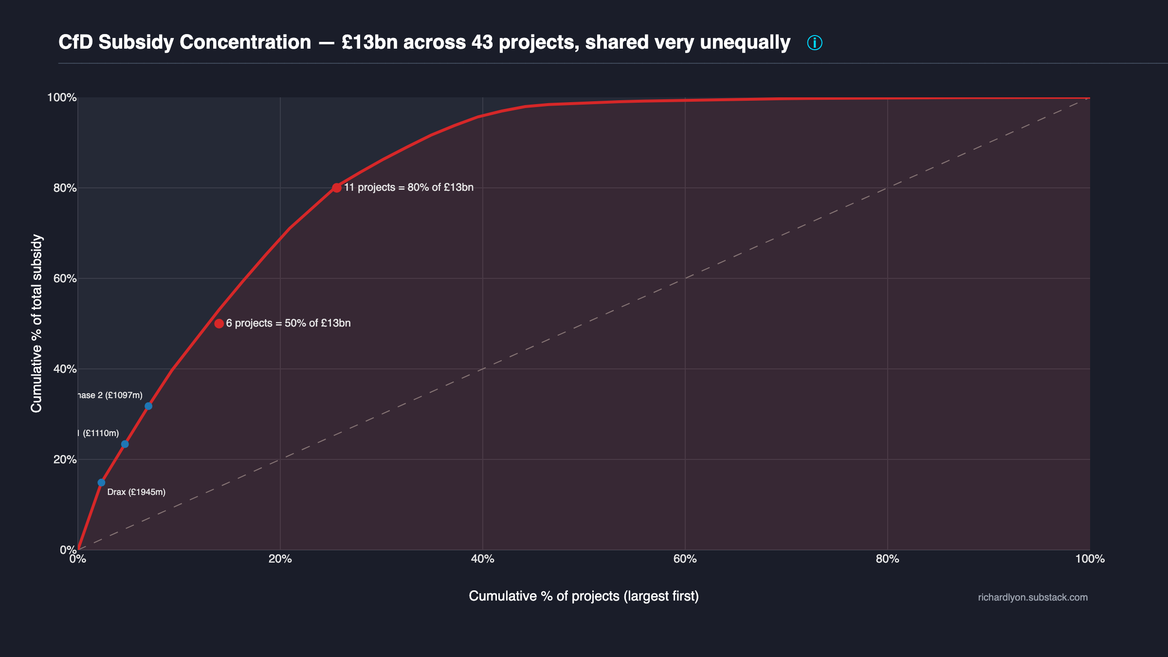
Lorenz curve — 6 projects = 50%
The inequality curve applied to CfD payments. Six projects receive half the £29bn spent; eleven receive 80%. Drax + Hornsea + Beatrice + Walney dominate.
-
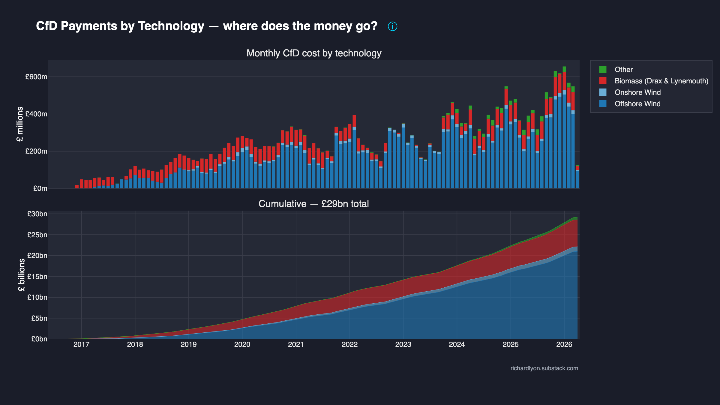
Payments by technology category
Monthly and cumulative CfD cost stacked by Offshore Wind, Onshore Wind, Biomass, and Other. Offshore and Drax biomass are the two dominant categories.
-
RO cost concentration — DEFERRED: data-gated
Station-level concentration analysis (Lorenz curve, top-N attribution) requires per-station ROC-issuance data that is no longer publicly downloadable. See RO §Concentration (currently deferred — data-gated).
What to look at next¶
Then → Cost to see the total the recipients are collecting, or → Cannibalisation for why wind's share of the pot keeps growing.
Methodology¶
How every number on this page was computed → Recipients methodology.