Wind + solar daily capacity factor — year × day-of-year heatmap
Two stacked heatmaps (wind top, solar bottom) rendering every day of the observed record as a colour-coded cell. Blue stripes across years are multi-week droughts — dunkelflaute made visible to the naked eye.
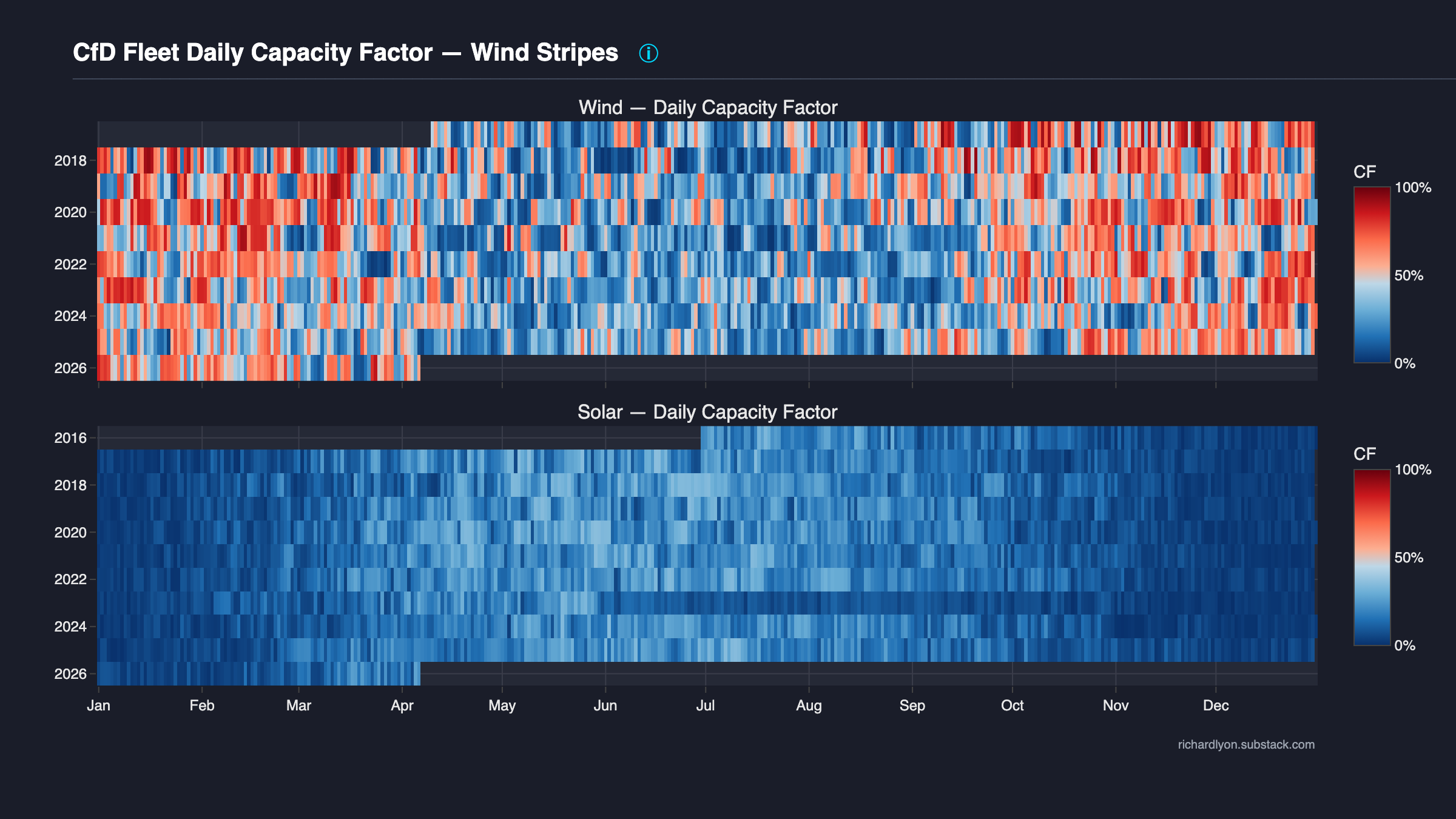
What the chart shows
Two stacked heatmaps sharing a common x-axis.
- Top panel — Wind (Offshore + Onshore combined, capacity-weighted). Rows are calendar years (2017 at the top, descending to the latest complete year); columns are day-of-year (1 to 366). Each cell's colour encodes the daily fleet capacity factor for that date.
- Bottom panel — Solar PV. Same axis layout, normalised to the installed solar CfD capacity on each date.
Colour scale runs from deep blue (0% CF) through light blue, pale red, and into deep red (100% CF). The shared 0–100% scale means the colour in one panel means the same thing as the colour in the other panel. Month labels (Jan, Feb, …, Dec) sit along the bottom x-axis; row labels on the y-axis are calendar years.
Droughts show up directly: a multi-week blue band crossing rows is a sustained fleet-wide low-output period. Solar's pattern is stark — every winter is a continuous blue band by construction. Wind's pattern is more scattered but economically more important because the CfD fleet is wind-dominant in both capacity and cost share.
The argument
Sustained low-output periods are structural, not exceptional. You can see them in the data with the naked eye.
Three paragraphs:
-
The chart is deliberately direct-access. There is no aggregation, no rolling window, no smoothing, no summary statistic. Every cell is one day's raw fleet capacity factor, organised into a year-on-year grid so the reader can inspect the evidence without trusting any author's framing. The chart says "look for yourself" more emphatically than any summary chart on this site can.
-
Blue stripes are the empirical record of droughts. Each horizontal blue band is a multi-day stretch where the CfD fleet produced far below its annual average. These are not modelled; they are every low-output event the fleet has lived through. The pattern repeats year-on-year: there is no year without substantial blue, and some years (notably summers of 2020 and 2021 for wind) are almost entirely in the cool half of the palette.
-
Solar's pattern is starker; wind's is economically weightier. Solar's mid-winter blue band is unavoidable — daylight hours shrink, zenith angle shallows, cloud cover is high. Nobody argues otherwise. The important argument is about wind: wind droughts are scattered, irregular, and not concentrated seasonally. They hit spring, summer, autumn and winter alike. A fleet relying on wind for bulk-energy cannot predict when a drought will occur — it can only observe that droughts do occur, repeatedly, by looking at this chart.
This is the companion page to rolling-minimum, which quantifies the blue stripes into specific drought durations and flags the worst events. The heatmap delivers the unaggregated raw-evidence visualisation; rolling-minimum delivers the quantified policy-relevant summary.
Methodology
Source: LCCC Actual CfD Generation (daily generation per unit) +
LCCC CfD Contract Portfolio Status (per-unit
Maximum_Contract_Capacity_MW and Technology_Type).
Daily CF per fleet:
installed_MW(d)    = sum(unit_capacity_MW for units active on day d)
daily_gen_MWh(d)   = sum(CFD_Generation_MWh on day d for tech group)
CF(d)              = daily_gen_MWh(d) / (installed_MW(d) × 24)
Unit-active-on-day logic: a unit contributes to installed_MW(d)
from its first observed generation date onwards (its
Maximum_Contract_Capacity_MW enters the running total). This means
pre-commissioning days where the unit was under construction are
excluded from both numerator and denominator — the CF reflects the
active fleet, not the paper fleet.
Heatmap assembly: pandas pivot with year on rows, day_of_year
on columns, fleet_cf as the colour value. Plotly go.Heatmap with
the custom colour scale (blue → red through a pale-neutral midpoint)
and shared zmin=0, zmax=1 across both panels so colour semantics
are absolute.
The two technology groups are computed independently from their own installed-capacity bases — wind's colour scale is normalised to wind's fleet, solar's to solar's fleet. See the Reliability methodology for the installed-capacity-over-time attribution rule and the rationale for splitting wind + solar rather than a combined fleet view.
Caveats
- Pre-commissioning days are excluded. A unit is counted from its first observed generation date, not its contract-start date. This avoids the "ramp-up dip" that would otherwise bias the left edge of every row with a new build.
- Leap-year day 366 is populated only for leap years (2020, 2024). Other years show column 366 blank by design — this is correct, not a rendering defect.
- Colour scale is shared but perceptually independent per-panel when the reader compares rows within a panel. A "dark blue" in the wind panel and a "dark blue" in the solar panel both represent roughly 0% CF, but the absolute MWh represented differs because wind's installed capacity is much larger than solar's.
- Fleet composition changes along rows. Early years are dominated by Investment-Contract offshore wind and Drax (biomass is not plotted here as its CF profile is dispatchable, not intermittent). Recent years include AR1–AR3 units. A single cell's CF reflects the fleet in place on that day, not a fixed reference fleet.
Data & code
- Generation data — LCCC Actual CfD Generation and avoided GHG emissions
- Portfolio data — LCCC CfD Contract Portfolio Status
- Chart source —
src/uk_subsidy_tracker/plotting/intermittency/generation_heatmap.py - Tests —
tests/test_schemas.py(validates both LCCC schemas the chart joins: daily generation + contract portfolio status).
To reproduce:
See also
- Rolling minimum — quantifies the blue stripes into 21-day drought durations.
- Seasonal capacity factor — same daily CF data aggregated to monthly profiles with DESNZ benchmark.
- Reliability methodology — CF formula + installed-capacity attribution rule.